Client: Euro Styl Developer
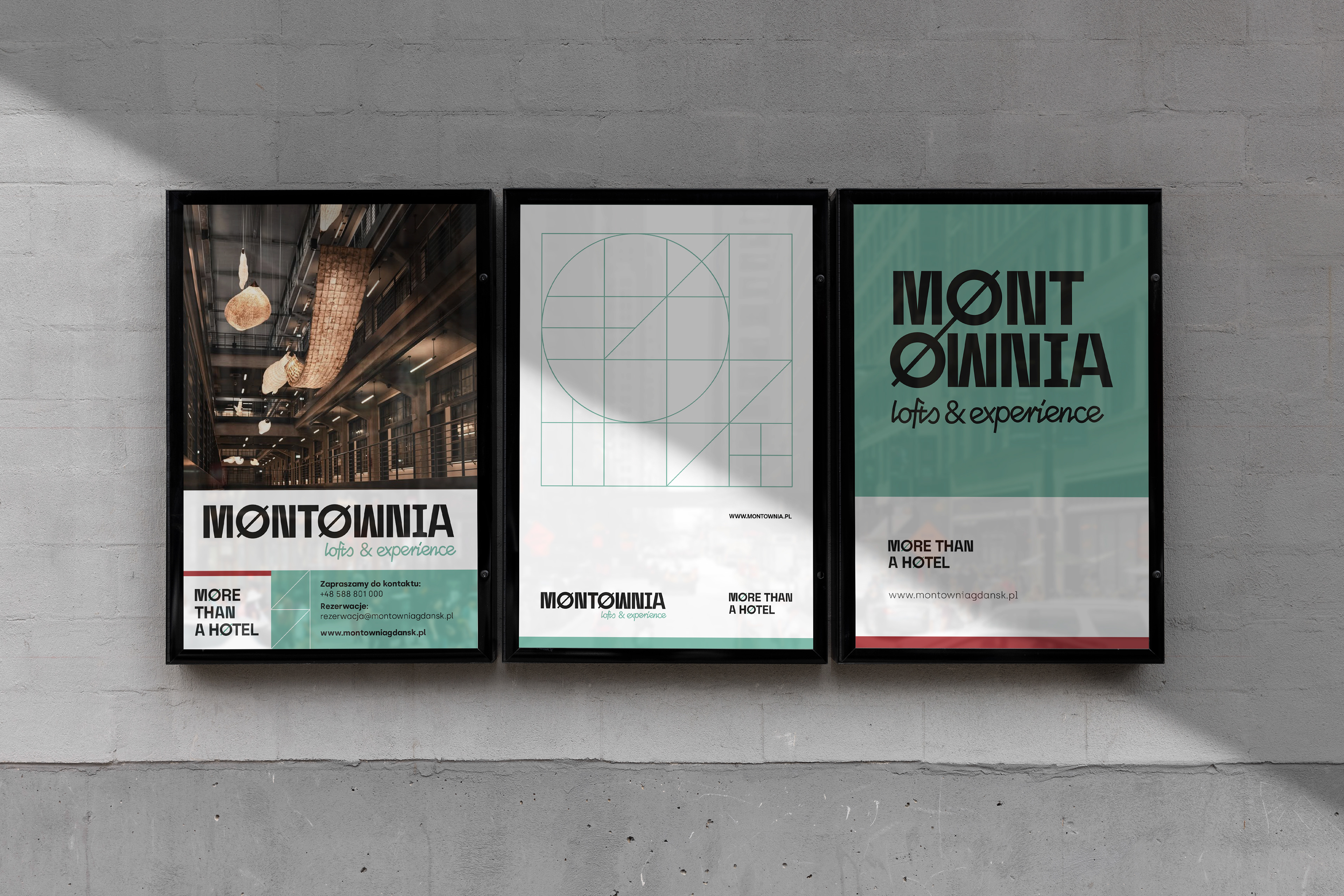
MONTOWNIA // FROM ASSEMBLY U-BOAT HALL TO HOTEL
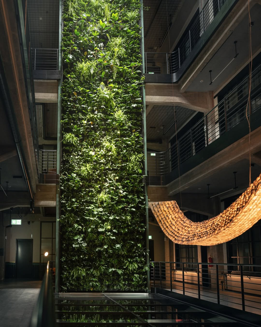
A historic building that combines hotel, restaurant and business functions. The main problem that the branding was supposed to solve: to emphasize the industrial atmosphere of the shipyard's surroundings while maintaining a visual lightness.
2024
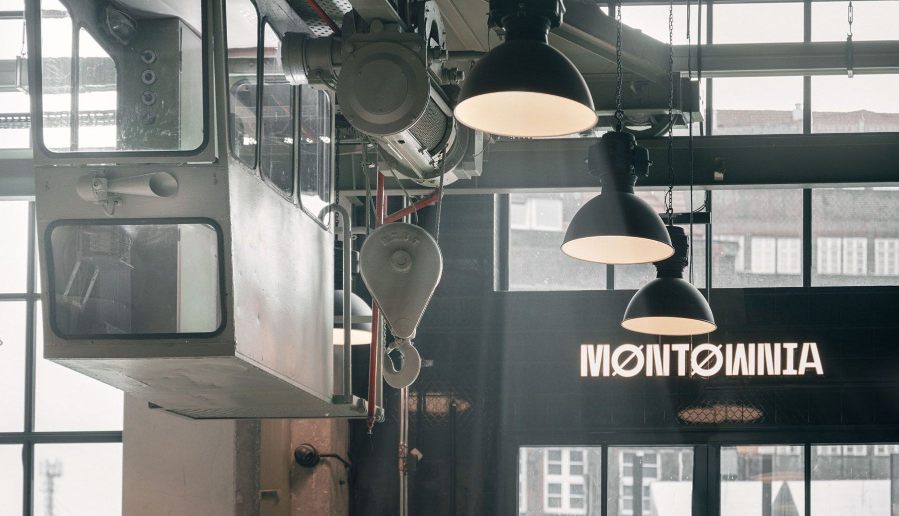
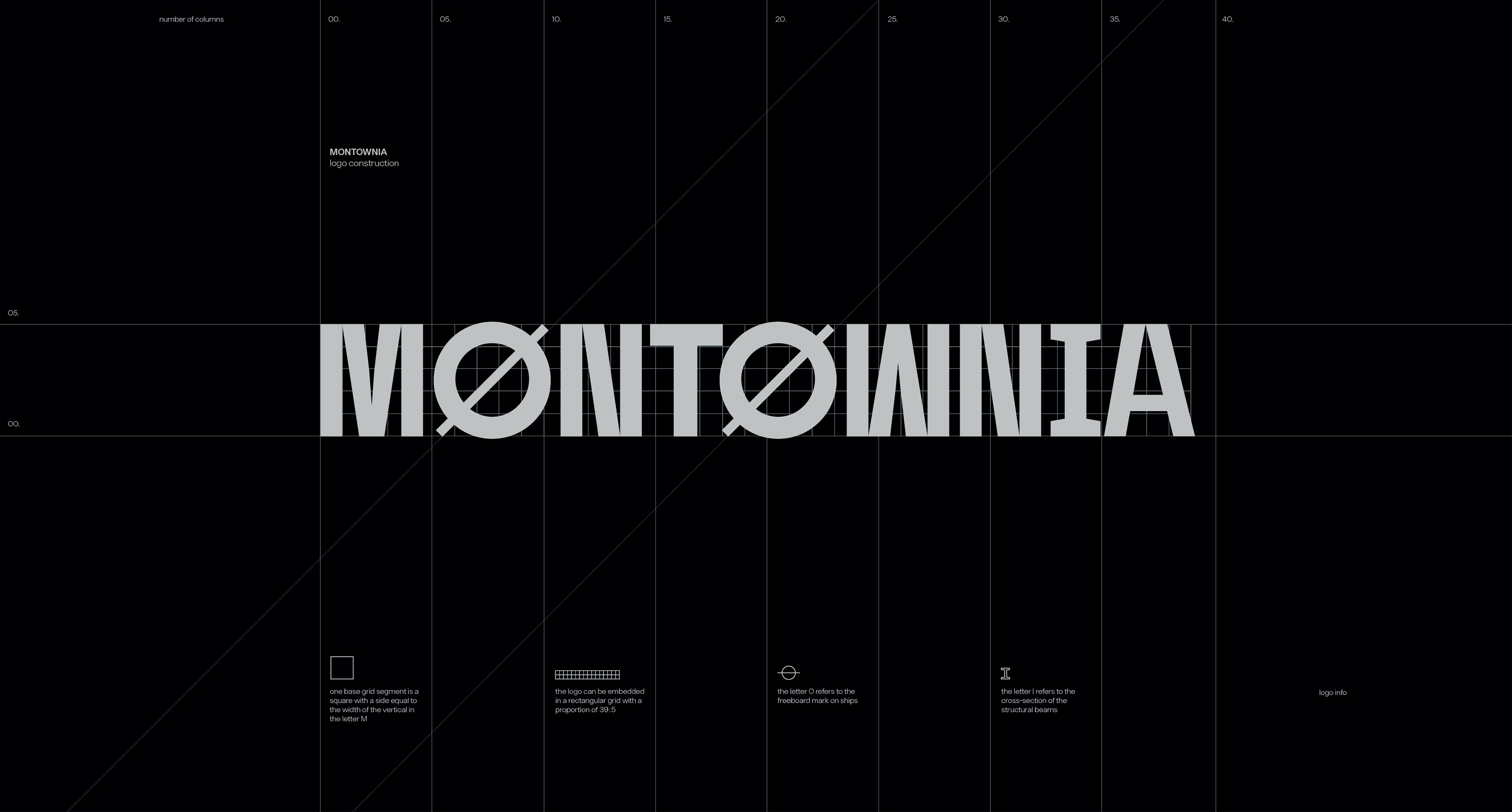
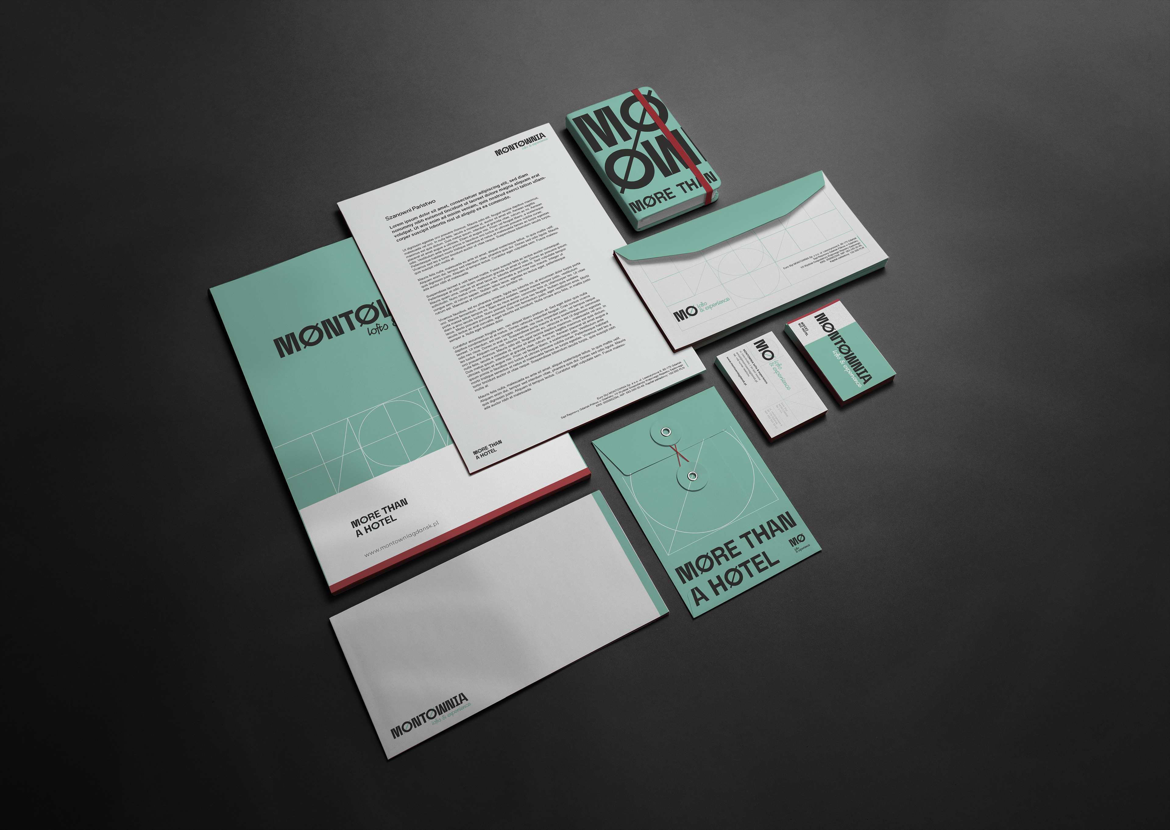
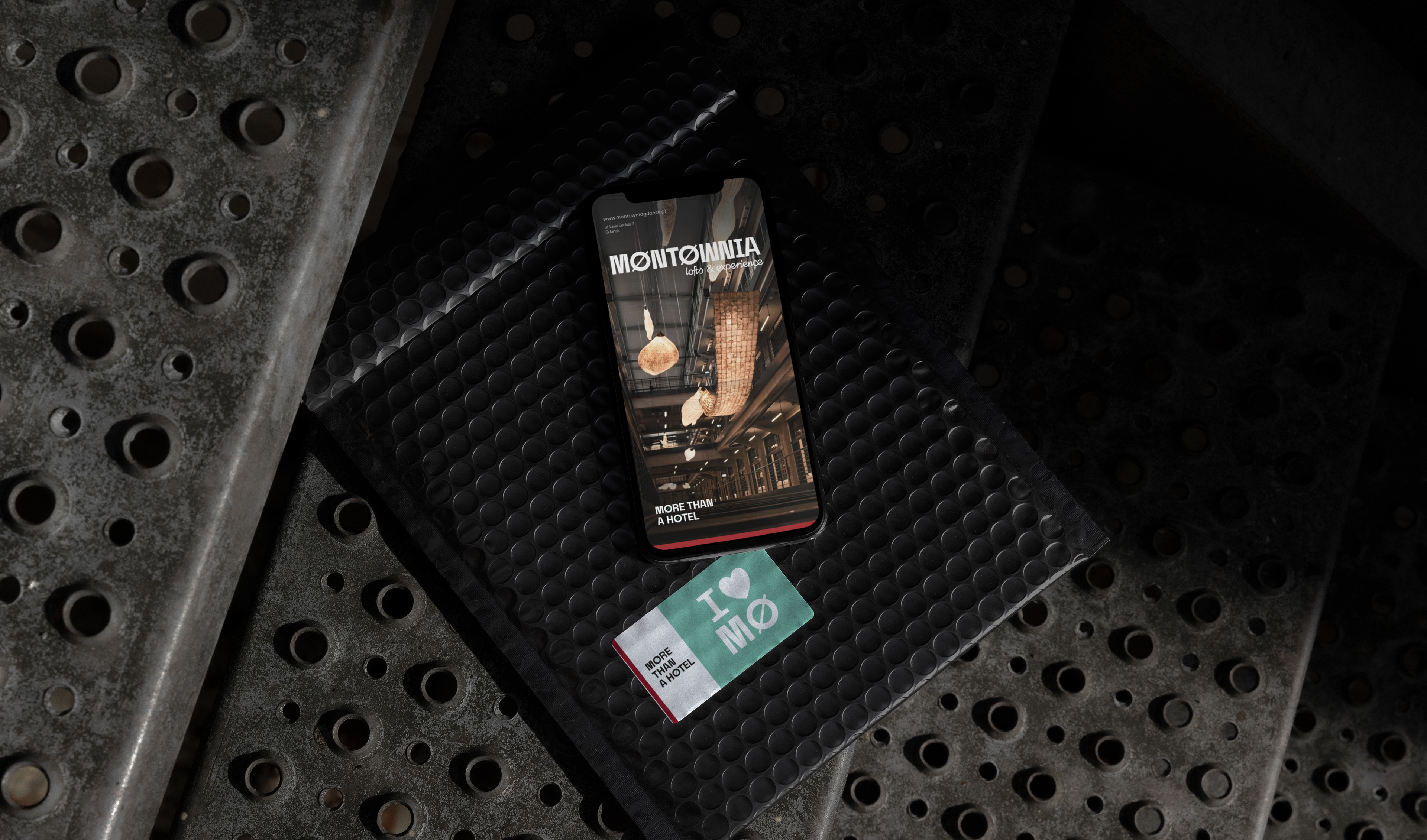
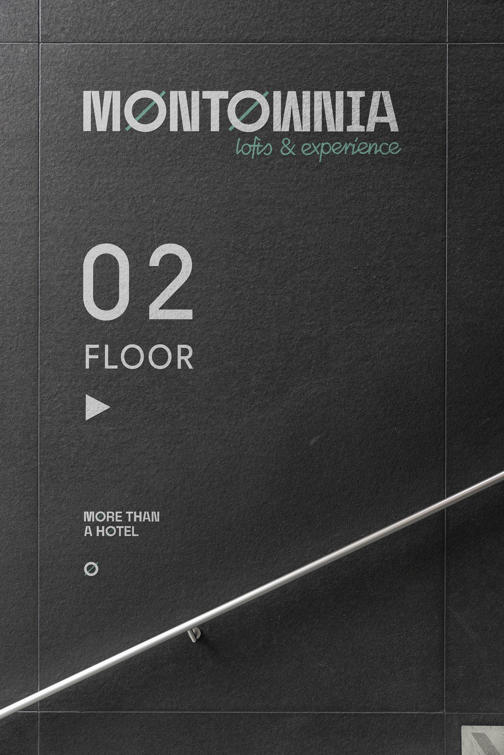
Logotype
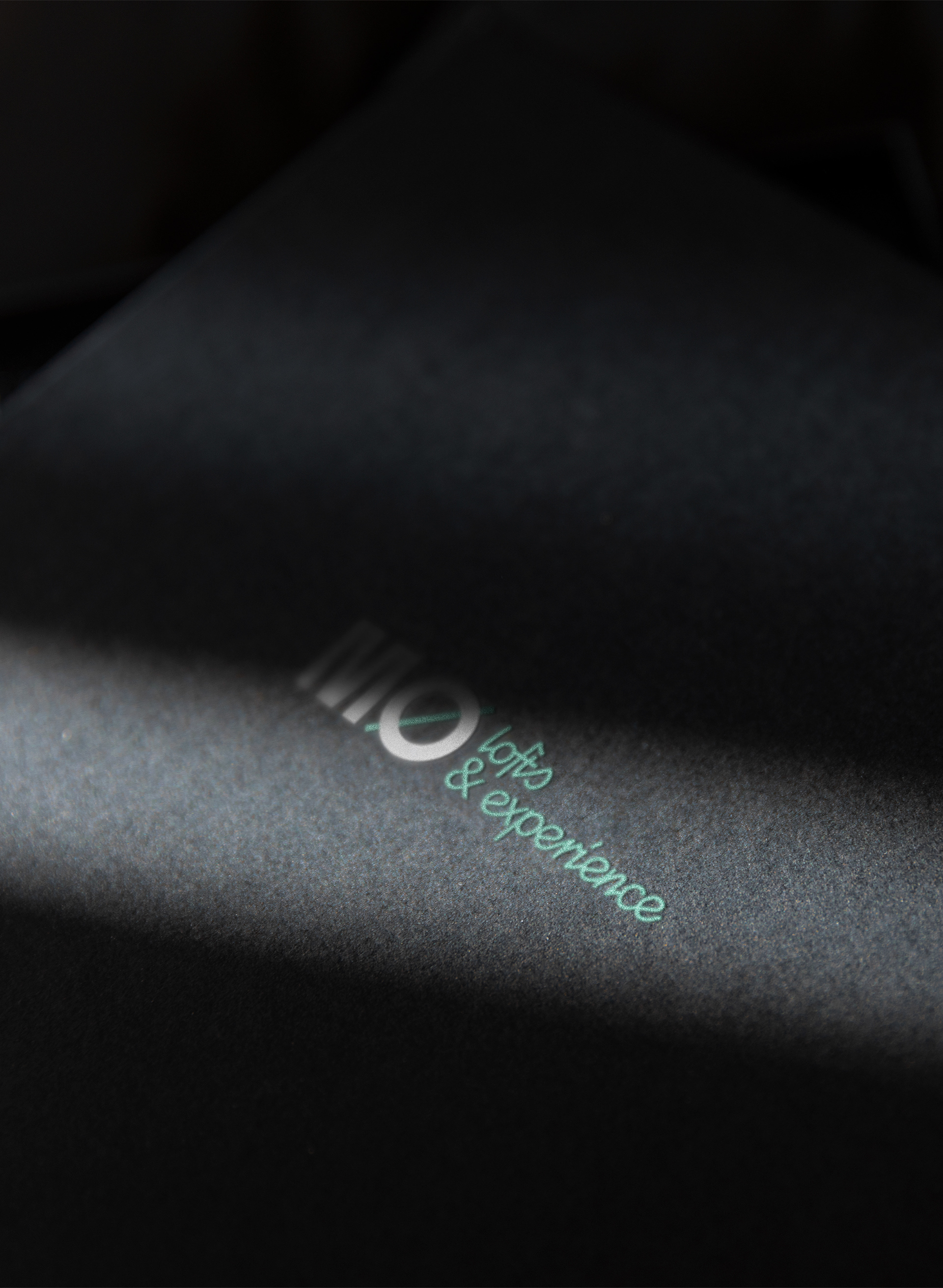
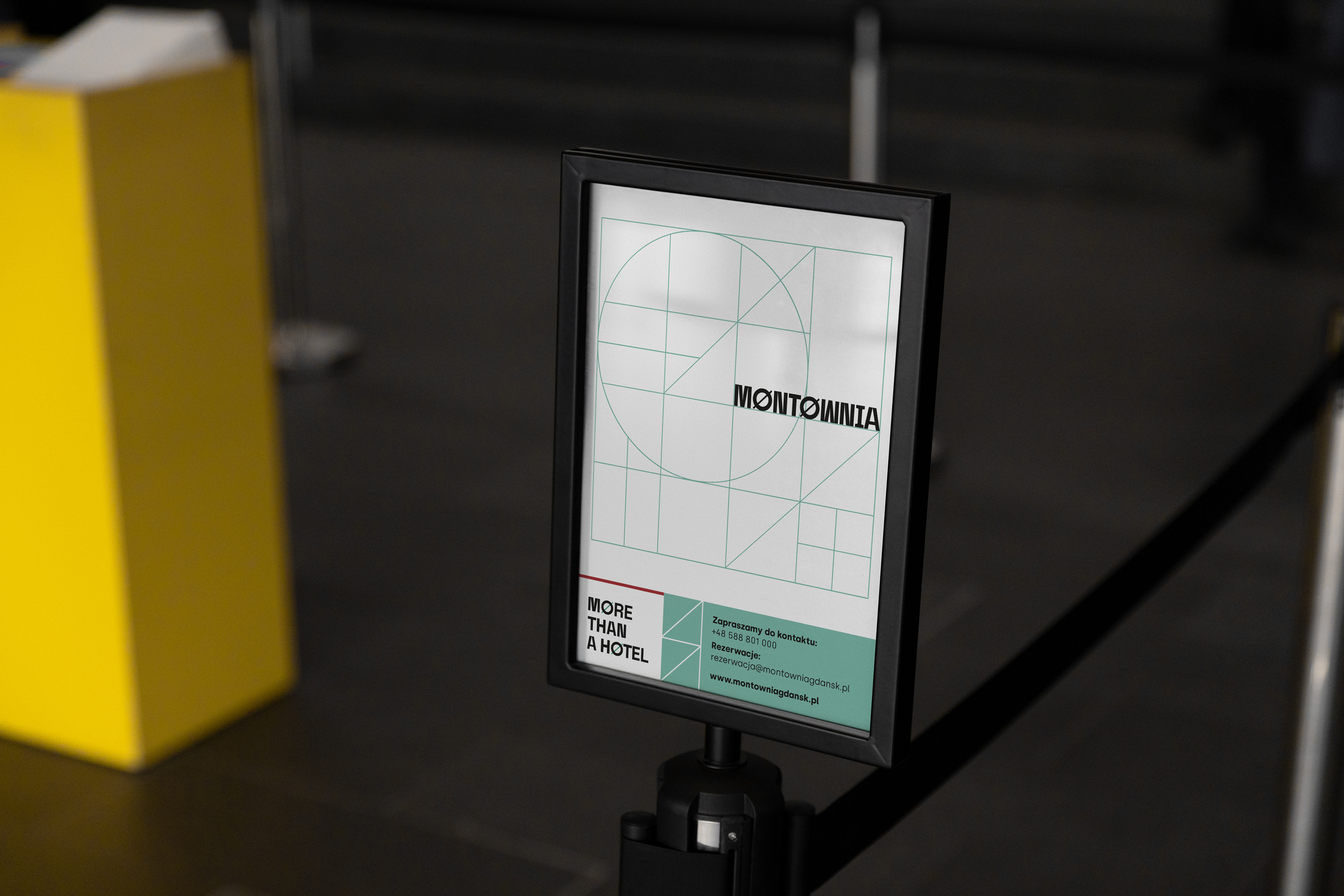
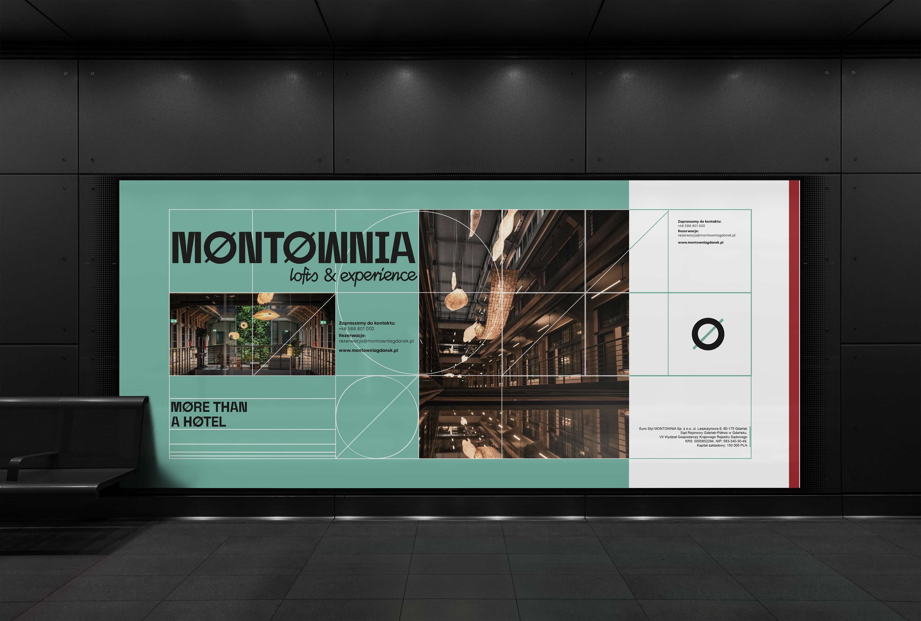
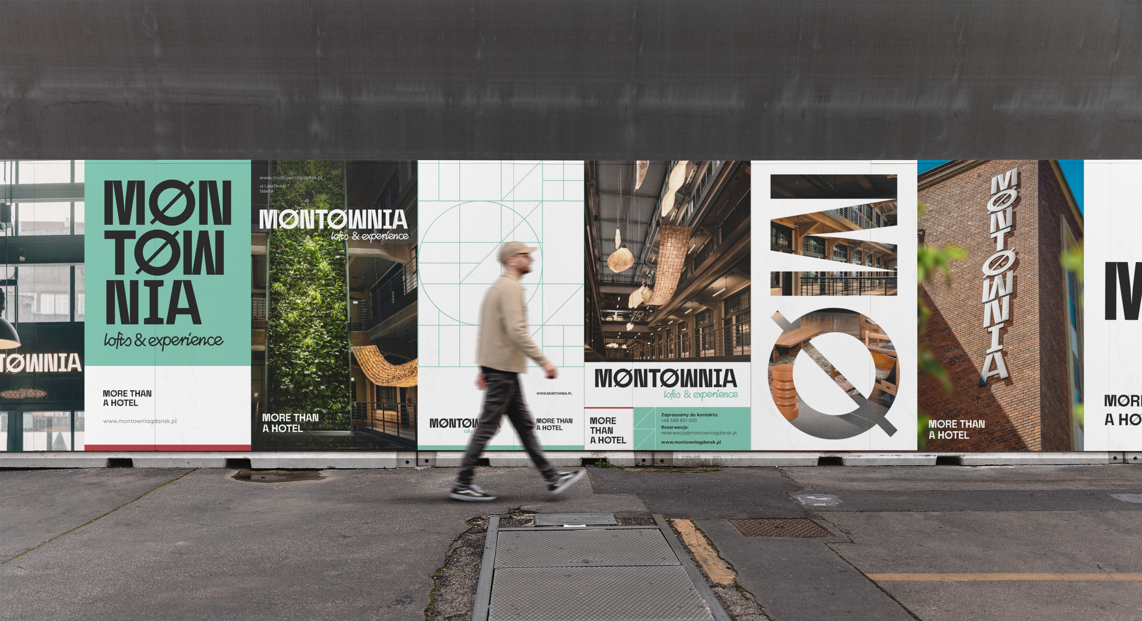
The logo's lettering is composed of stark, segmented elements. The freeboard symbol seen on ships is incorporated into the letters O.
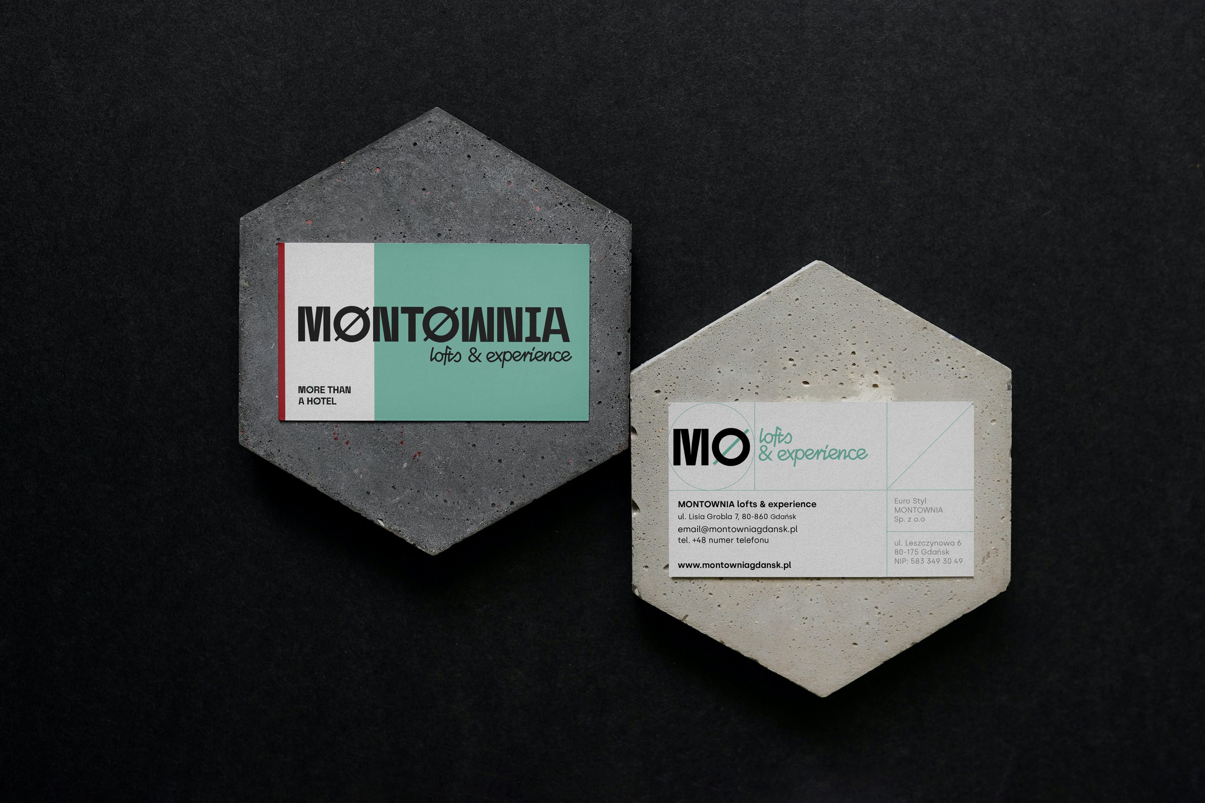
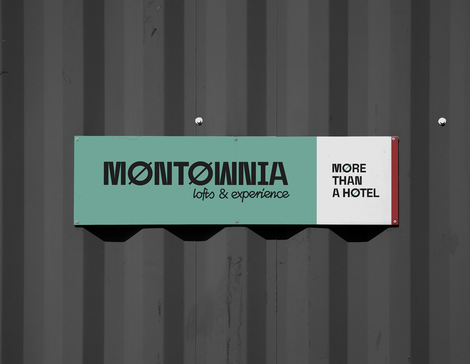
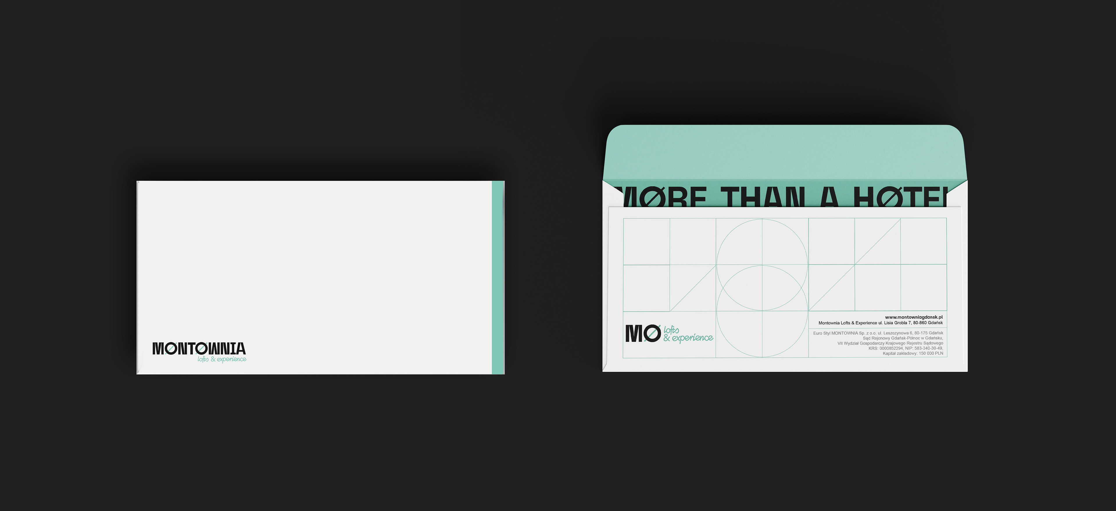
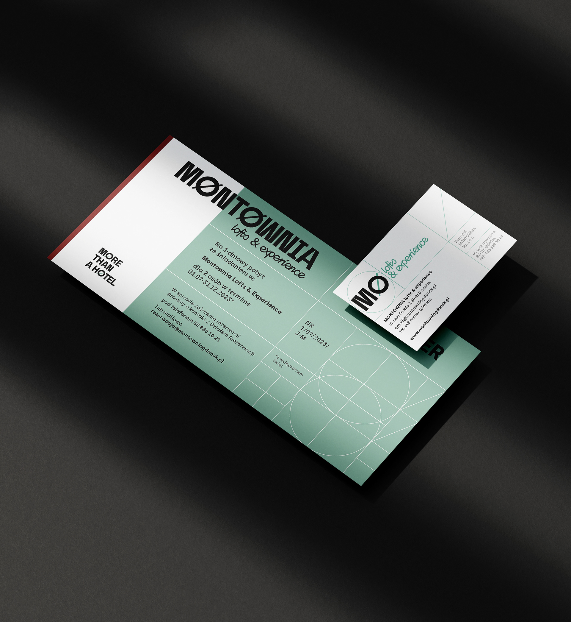
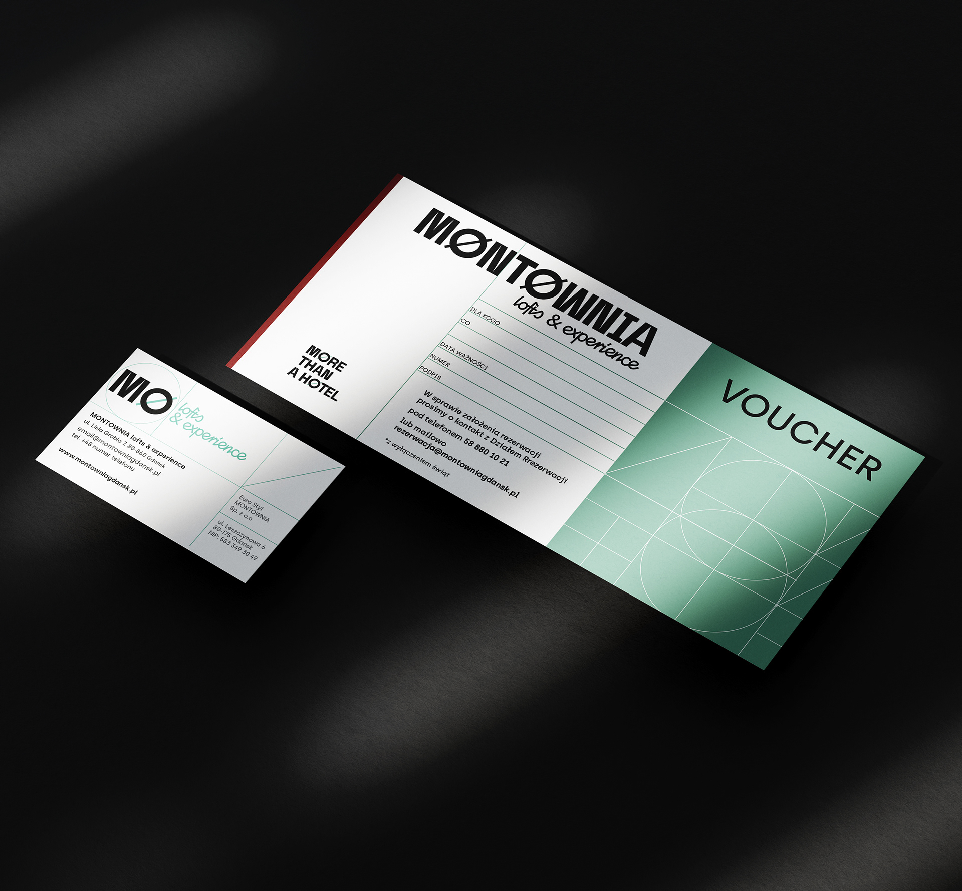
Colors
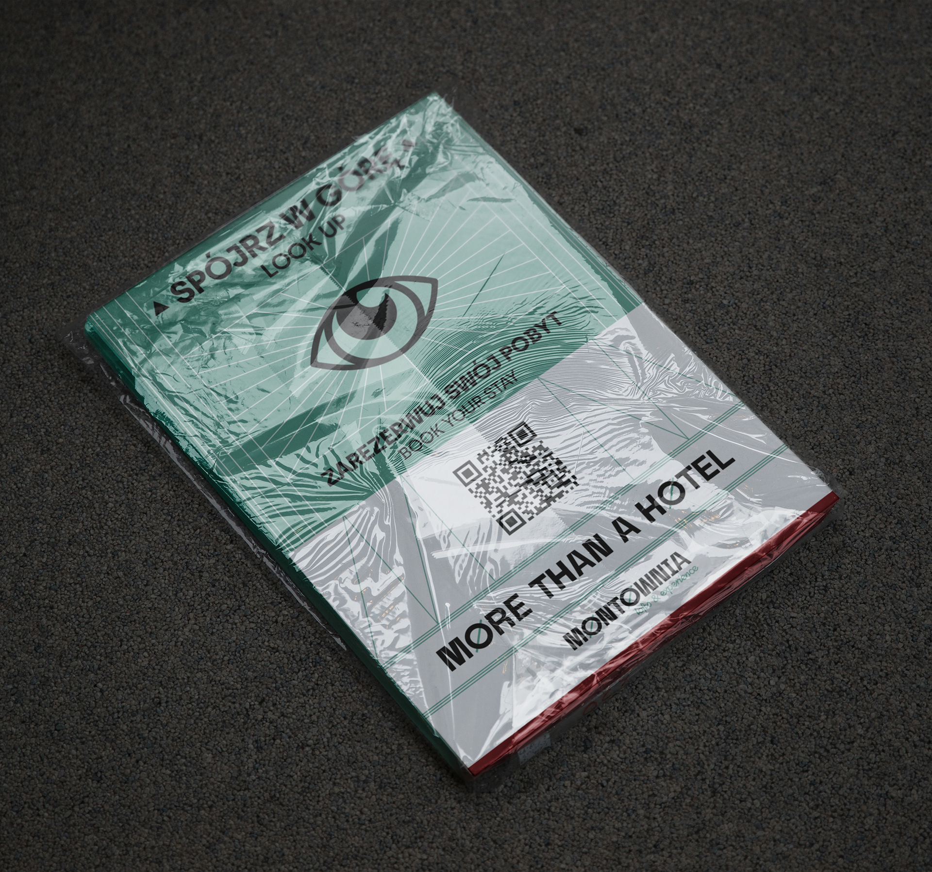
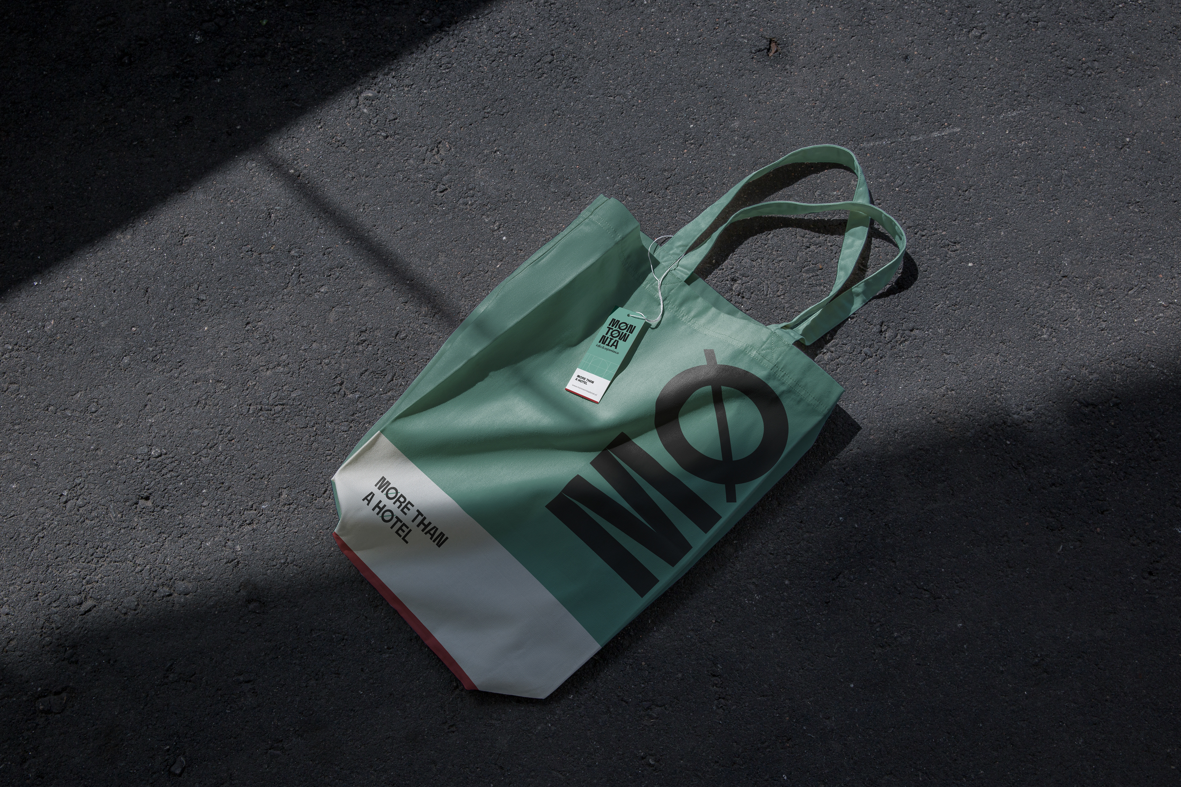
The main branding color, green, is the color originally used to paint functional elements in the historic building. The red refers to the color used
to paint the sides of ships.
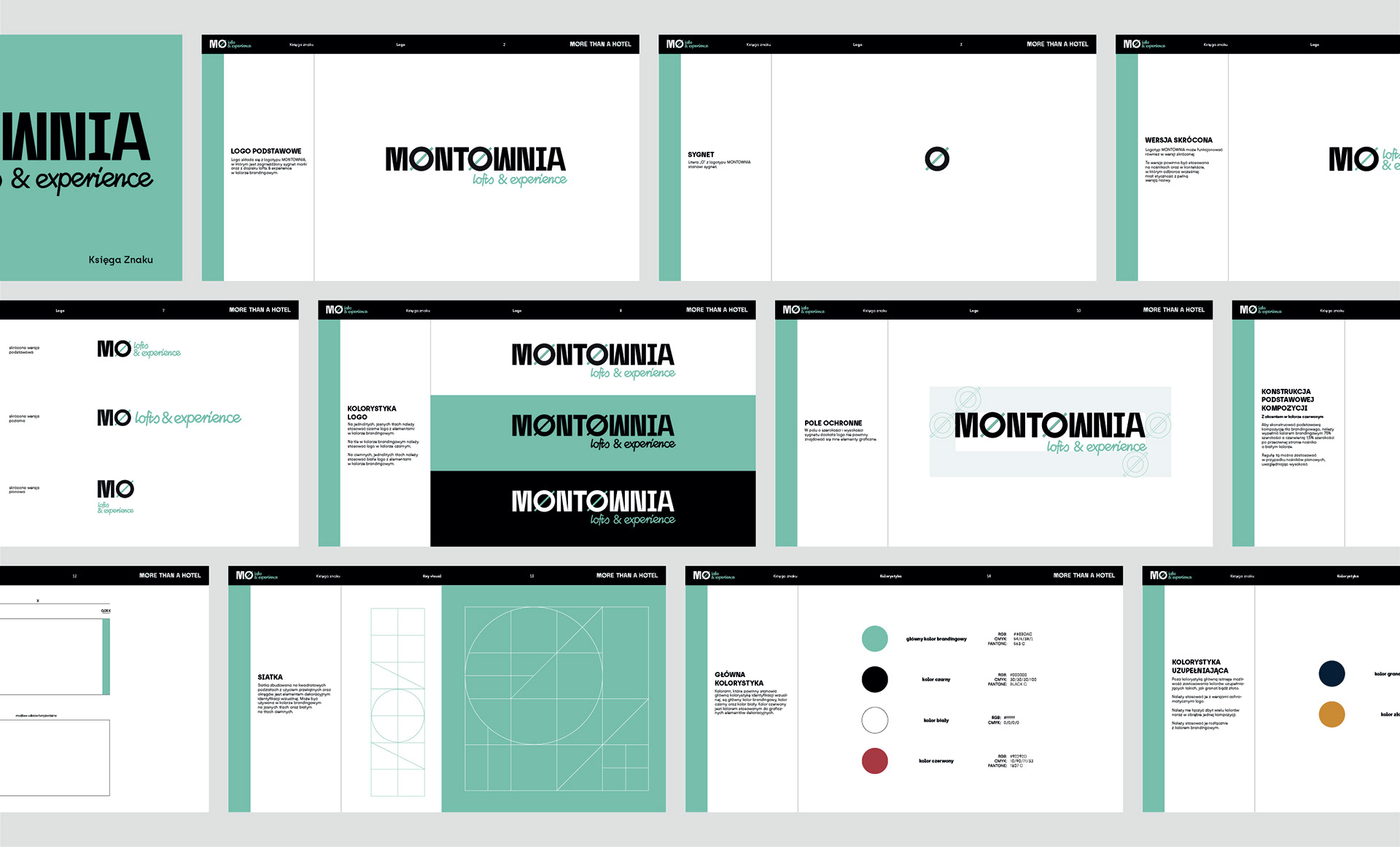
Key Visual
The key visual is based on a simple and elegant division in two variants, offering numerous customization options depending on your needs. A distinctive element is the visible structural grid, a characteristic feature of a shipyard: visible scaffolding, structure, lines, and divisions.